- Getting Started with Ultimate Addons for Elementor
- Getting Started with Ultimate Addons for Elementor Pro
- How To Install The Ultimate Addons For Elementor Pro Plugin?
- How to Get License Key of Ultimate Addons for Elementor?
- Activate Ultimate Addons for Elementor Pro License
- How Can I Upgrade the License?
- How to Update Ultimate Addons for Elementor Plugin?
- How to update any plugin manually through FTP?
- About Beta Versions
- About Beta Versions
- How to Enable / Disable Widgets in UAE to Reduce Server Requests?
- How to White Label UAE?
- Getting Started with Ultimate Addons for Elementor Pro
- UAE Saved Sections
- How to create Google API key in Google Maps Widget of UAE?
- White Screen /500 Error After Plugin Installation
- How to Increase the Memory Limit of your site?
- Unable to see the Font Awesome 5 Icons in UAE’s widgets?
- Introducing User Registration Form Widget
- How to Create a User Registration Form using Elementor?
- How to Create a User Registration Form with Only Email Field in Elementor?
- Frequently Asked Questions about User Registration Forms
- Google reCAPTCHA v3 in User Registration Form for Elementor
- Honeypot field in User Registration Form for Elementor
- Filters/Actions for User Registration Form Widget
- How to Integrate hCaptcha with UAE Login & Registration Forms
- How to Create a Facebook App ID for Login Form Widget?
- How to Create a Google Client ID for Login Form Widget?
- Introducing a New Login Form Widget for Elementor
- Filters/Actions for Login Form Widget
- Google reCAPTCHA v3 in Login Form for Elementor
- How to Integrate hCaptcha with UAE Login & Registration Forms
- How to Open a Modal Popup on the Click of an Elementor Widget?
- Modal Popup Widget
- How to Trigger a Modal Popup on the Click of a Menu Element?
- How To Close a Modal Popup on the Click of a Button or Text?
- How to Insert a Video in the UAE Modal Popup?
- What are the Various Options to Close a Modal Popup in UAE?
- How to Display a Modal Popup on Exit Intent?
- Modal Popup JS Triggers
- Woo – Products Widget
- How to display exact WooCommerce product with Query Builder?
- How to set Grid and Carousel layout for WooCommerce products?
- Filters/Actions for WooCommerce Products
- How to enable Quick View for WooCommerce Products?
- How to Exclude WooCommerce Products with Woo-Products Widget?
- How to Set Featured Products in WooCommerce?
- Woo – Products Carousel Does Not Display Correctly?
- How to Display Related Products with Woo-Products Widget?
- How To Add Rows And Columns to the Table?
- Table Widget
- How to add Table Header with Table Widget?
- How to add Table Content with Table Widget?
- How to add Sortable and Searchable Table? How to Show Entries Dropdown?
- How to Merge Columns and Rows in Table?
- How to Style the Table?
- Create Table by Uploading CSV
- Facing Issues with CSV Import?
- Image Gallery Widget
- How to Set Categories for Images?
- How to Add an Image Caption
- How to Set a Custom Link for the Image?
- How to Design Filterable Image Gallery?
- How to Open a Webpage with the Click of an Image?
- How to Set Scale, Opacity, Effects, Overlay Color for Images?
- How to Display Specific Category Tab as a Default on Page Load?
- How to Set Icon on Image Hover?
- Video Gallery Widget
- How to Set Categories for Videos?
- How to Design Filterable Video Gallery?
- How to Display Specific Video Category Tab as a Default on Page Load?
- How to Set a Custom Placeholder Image for the Video?
- How to Set Overlay Color on the Video Thumbnail on Mouse Hover?
- How to Show Video Caption on Hover?
- How to Show Video Category on Hover?
- Bulk Editing for Video Category Names
- How to Style Particular Item / Icon?
- Timeline Widget
- How to Change the Vertical Position of Arrow & Icon?
- How to Set On-Scroll Color for Connector Line and Icon?
- How to Set the Alternate Alignment for the Card Content?
- How to Manage Timeline on Responsive View?
- How Query Builder Works for Post Timeline?
- How to Set Post as Sticky?
- Enable Infinite Load Pagination for Post Timeline
- Posts Widget
- How Query Builder Works for Posts Widget?
- How to Enable Infinite Load Pagination for Posts?
- Filters/Actions for Posts Widget
- Filterable Tabs for Posts Widget
- Layouts for Posts Widget
- Posts Widget Carousel Does Not Display Correctly?
- Displaying Portfolios in UAE Post Widget Using Custom Filters
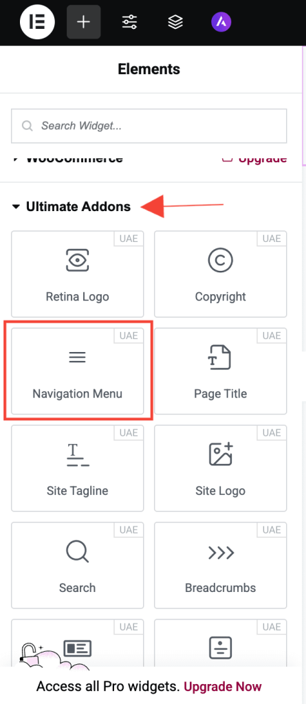
Navigation Menu
The Navigation Menu widget in UAE Lite allows you to create a sleek, mobile-friendly navigation bar that fits seamlessly into your Elementor layout. It comes with powerful customization options for layout, styling, and interactions perfect for building intuitive and elegant site menus without coding.
Let’s explore how to use the Navigation Menu widget and all the customization options it offers.
How to Use the Navigation Menu Widget
Step 1: Add the Widget
- Edit your page with Elementor.
- Search for Navigation Menu in the widgets panel.
- Drag and drop the widget onto your page.
Step 2: Select Menu
- In the Content tab, go to the Menu section.
- Choose the menu you want to display from the dropdown. This dropdown lists all menus created via Appearance > Menus in WordPress.
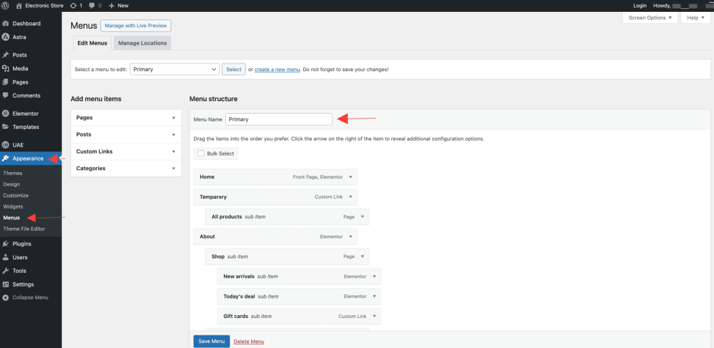
Tip: Want to create a new menu? Head to WordPress Dashboard → Appearance → Menus.
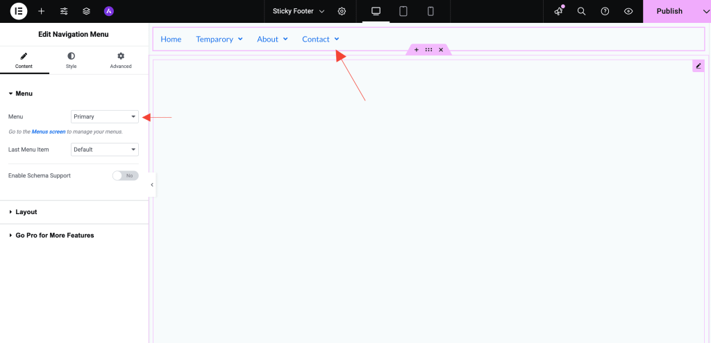
Navigation Menu Widget Settings
Content Tab
Menu
- Select Menu: Choose a WordPress menu to display.
- Last Menu Item as Button: Convert the final menu item into a button ideal for actions like Contact, Buy Now, or Get Started.
- Enable Schema Support: Add schema markup to improve SEO and structured data compatibility.
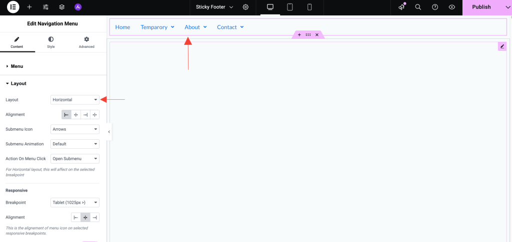
Layout
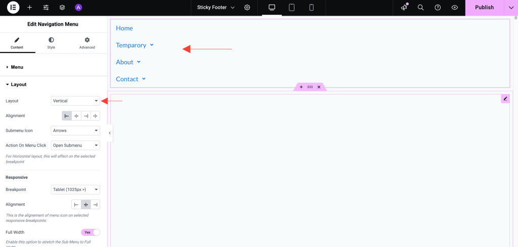
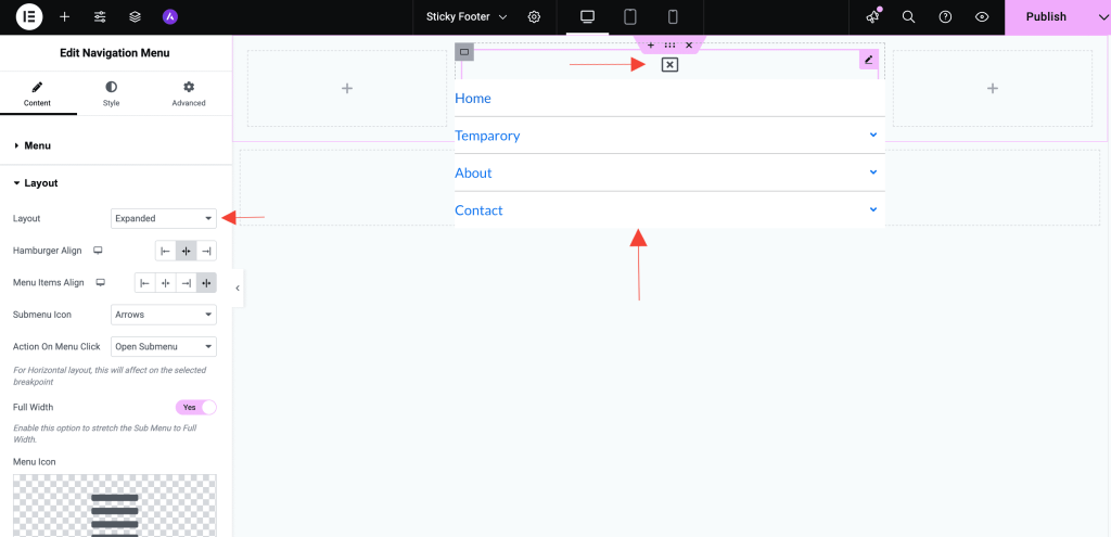
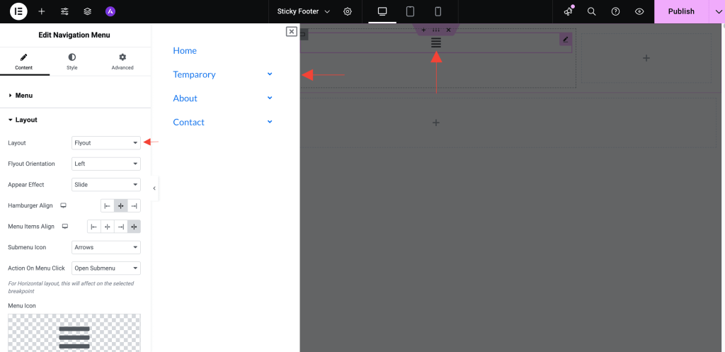
- Layout: Choose from Horizontal, Vertical, Expanded, or Flyout layouts.
Layout Options Explained
The Layout setting controls how your navigation menu appears and behaves on the page. UAE Lite offers four flexible layout styles to suit different design needs and use cases:
1. Horizontal
- Description: Displays all menu items in a single horizontal row, typically used in website headers.
- Best For: Traditional top-bar navigation menus.
- Behavior: Submenus drop down vertically beneath the parent menu item.
2. Vertical
- Description: Stacks menu items in a vertical column, usually placed in sidebars or off-canvas panels.
- Best For: Sidebar menus, especially on blogs, portfolios, or service-based websites.
- Behavior: Submenus expand downward, nested under the main menu item.
3. Expanded
- Description: Hamburger Icon will display, and on clicking it, the menu will slide in fully expanded with all submenu items visible.
- Best For: Ideal for simple mobile menus where users need quick access to all navigation options without interaction.
- Behavior: Menu and all submenu items appear at once, reducing clicks and improving accessibility on small screens.
4. Flyout
- Description: A modern, interactive layout where submenu items “fly out” vertically after clicking the Hamburger Icon, with options like Flyout
- Orientation (Left/Right), Appear Effect (Slide/Push), Hamburger Align (Left/Center/Right), and Menu Items Align (Left/Center/Right/Justify).
- Best For: Perfect for mobile or off-canvas navigation where space is limited and a clean, layered interface is needed.
- Behavior: Menu opens from the side and submenus expand dynamically, providing an organized, animated experience.
When to Use Each Layout
| Layout | Use Case | Placement Suggestions |
|---|---|---|
| Horizontal | Classic top navigation | Header section |
| Vertical | Sidebar or slide-in menus | Side panels, footers |
| Expanded | Simple mobile menus that reveal all items at once | Mobile headers, off-canvas menus |
| Flyout | Interactive, layered navigation with submenu | Mobile menus, mega menus, sidebars |
Other Settings
- Alignment: Set the alignment of the menu – Left, Center, Right, or Justify.
- Submenu Icon: Select submenu indicator style – Arrows, Plus Sign, or Classic.
- Submenu Animation: Select submenu animation – Default or Slide Up.
- Action on Menu Click: Define behavior when a menu item with sub-items is clicked – Open Submenu or Redirect to Self Link.
Responsive
- Breakpoint: Define when the mobile menu activates – Mobile (768px >), Tablet (1025px >), or None.
- Alignment: Align the responsive menu – Left, Center, or Right.
- Full Width: Enable toggle to stretch the mobile menu across the full width.
- Menu Icon: Choose an icon for opening the mobile menu.
- Close Icon: Choose an icon for closing the mobile menu.
Style Tab
Main Menu
- Typography: Adjust the font size, family, and weight of main menu items.
- Text Color: Set different text colors for normal and hover states.
- Background Color: Customize background colors for both default and hover states.
- Padding: Define spacing within each menu item.
Dropdown
- Typography & Colors: Control text and background styling for submenu items.
- Box Shadow & Border Radius: Add depth and rounded corners to the submenu.
- Padding: Set inner spacing for submenu items.
- Divider: Insert dividers between submenu items for visual separation.
Menu Trigger & Close Icon
- Icon Size: Customize the size of the mobile menu trigger and close icons.
- Color & Background Color: Set icon and background colors for the menu icon.
- Border Width: Define the border width around the menu icon.
- Border Radius: Adjust the roundness of the icon’s border.
Button
- Typography: Customize font styling of the button.
- Padding: Adjust internal spacing within the button.
- Text Color: Set button text color.
- Background Type: Choose a solid color, gradient, or image background.
- Border Type: Select border style – None, Solid, Double, Dotted, Dashed, or Groove.
- Border Radius: Control the curvature of the button corners.
- Box Shadow: Add shadows for a raised or floating effect.
Responsive Controls
- Fully responsive and optimized for all screen sizes.
- Customize visibility and layout independently for desktop, tablet, and mobile.
Use Cases
- Header navigation menus
- Sidebar vertical menus
- Mobile-friendly collapsible menus
- Multi-level dropdown menus
Frequently Asked Questions
Need Help?
If you have any questions or face issues while using the widget, feel free to reach out to our support team or check out more UAE Documentation.
We don't respond to the article feedback, we use it to improve our support content.