- Getting Started with Ultimate Addons for Elementor
- Getting Started with Ultimate Addons for Elementor Pro
- How To Install The Ultimate Addons For Elementor Pro Plugin?
- How to Get License Key of Ultimate Addons for Elementor?
- Activate Ultimate Addons for Elementor Pro License
- How Can I Upgrade the License?
- How to Update Ultimate Addons for Elementor Plugin?
- How to update any plugin manually through FTP?
- About Beta Versions
- About Beta Versions
- How to Enable / Disable Widgets in UAE to Reduce Server Requests?
- How to White Label UAE?
- Getting Started with Ultimate Addons for Elementor Pro
- UAE Saved Sections
- How to create Google API key in Google Maps Widget of UAE?
- White Screen /500 Error After Plugin Installation
- How to Increase the Memory Limit of your site?
- Unable to see the Font Awesome 5 Icons in UAE’s widgets?
- Introducing User Registration Form Widget
- How to Create a User Registration Form using Elementor?
- How to Create a User Registration Form with Only Email Field in Elementor?
- Frequently Asked Questions about User Registration Forms
- Google reCAPTCHA v3 in User Registration Form for Elementor
- Honeypot field in User Registration Form for Elementor
- Filters/Actions for User Registration Form Widget
- How to Integrate hCaptcha with UAE Login & Registration Forms
- How to Create a Facebook App ID for Login Form Widget?
- How to Create a Google Client ID for Login Form Widget?
- Introducing a New Login Form Widget for Elementor
- Filters/Actions for Login Form Widget
- Google reCAPTCHA v3 in Login Form for Elementor
- How to Integrate hCaptcha with UAE Login & Registration Forms
- How to Open a Modal Popup on the Click of an Elementor Widget?
- Modal Popup Widget
- How to Trigger a Modal Popup on the Click of a Menu Element?
- How To Close a Modal Popup on the Click of a Button or Text?
- How to Insert a Video in the UAE Modal Popup?
- What are the Various Options to Close a Modal Popup in UAE?
- How to Display a Modal Popup on Exit Intent?
- Modal Popup JS Triggers
- Woo – Products Widget
- How to display exact WooCommerce product with Query Builder?
- How to set Grid and Carousel layout for WooCommerce products?
- Filters/Actions for WooCommerce Products
- How to enable Quick View for WooCommerce Products?
- How to Exclude WooCommerce Products with Woo-Products Widget?
- How to Set Featured Products in WooCommerce?
- Woo – Products Carousel Does Not Display Correctly?
- How to Display Related Products with Woo-Products Widget?
- How To Add Rows And Columns to the Table?
- Table Widget
- How to add Table Header with Table Widget?
- How to add Table Content with Table Widget?
- How to add Sortable and Searchable Table? How to Show Entries Dropdown?
- How to Merge Columns and Rows in Table?
- How to Style the Table?
- Create Table by Uploading CSV
- Facing Issues with CSV Import?
- Image Gallery Widget
- How to Set Categories for Images?
- How to Add an Image Caption
- How to Set a Custom Link for the Image?
- How to Design Filterable Image Gallery?
- How to Open a Webpage with the Click of an Image?
- How to Set Scale, Opacity, Effects, Overlay Color for Images?
- How to Display Specific Category Tab as a Default on Page Load?
- How to Set Icon on Image Hover?
- Video Gallery Widget
- How to Set Categories for Videos?
- How to Design Filterable Video Gallery?
- How to Display Specific Video Category Tab as a Default on Page Load?
- How to Set a Custom Placeholder Image for the Video?
- How to Set Overlay Color on the Video Thumbnail on Mouse Hover?
- How to Show Video Caption on Hover?
- How to Show Video Category on Hover?
- Bulk Editing for Video Category Names
- How to Style Particular Item / Icon?
- Timeline Widget
- How to Change the Vertical Position of Arrow & Icon?
- How to Set On-Scroll Color for Connector Line and Icon?
- How to Set the Alternate Alignment for the Card Content?
- How to Manage Timeline on Responsive View?
- How Query Builder Works for Post Timeline?
- How to Set Post as Sticky?
- Enable Infinite Load Pagination for Post Timeline
- Posts Widget
- How Query Builder Works for Posts Widget?
- How to Enable Infinite Load Pagination for Posts?
- Filters/Actions for Posts Widget
- Filterable Tabs for Posts Widget
- Layouts for Posts Widget
- Posts Widget Carousel Does Not Display Correctly?
- Displaying Portfolios in UAE Post Widget Using Custom Filters
Info Card Widget
Customizable Info Card for Elegant Content Layouts
The Info Card widget in UAE Lite lets you create beautifully designed content blocks that combine text, icons, and buttons in a sleek card layout. Whether you’re highlighting features, showcasing services, or displaying key messages, the Info Card widget helps you present content in a visually appealing and structured format.
How to Use the Info Card Widget
Step 1: Add the Widget
- Open the Elementor editor on your page.
- Search for the “Info Card” widget in the UAE Lite panel.
- Drag and drop the widget into your desired section.
Step 2: Customize Content
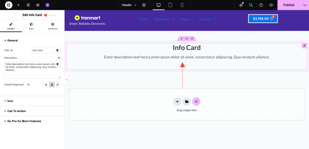
Under the Content tab, you’ll find the following sections:
General
- Title: Enter a heading for your info card.
- Description: Add supporting text or details.
- Overall Alignment: Choose how the content aligns within the card – Left, Center, or Right.

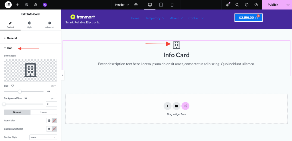
Icon
- Icon/SVG: Select an icon from the library or upload your own SVG to visually represent the content.

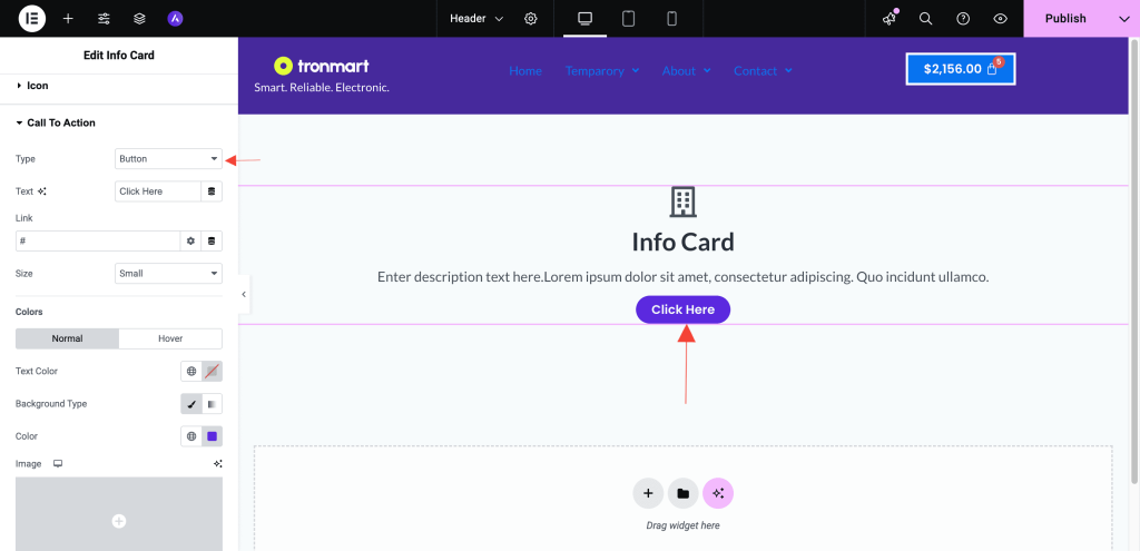
Call To Action
- Type: Choose between None, Text, or Button based on how you want the call to action to appear.
- Button Text & Link: Add a call-to-action button with your custom label and a URL to redirect users.
- Size: Select from Extra Small, Small, Medium, Large, or Extra Large to control the button dimensions.
- Colors & Styling:
- Text Color
- Background Color
- Border Type
- Rounded Corners
- Padding

Step 3: Style Your Card
Switch to the Style tab to personalize the appearance of your Info Card:
Typography
- Modify fonts, sizes, and colors for the title, description and call-to-action text.
Margin
- Add margin to the the title, description and call-to-action text.
Step 4: Responsive Settings
Ensure your Info Card looks perfect on all devices:
- Use Elementor’s responsive settings to adjust padding, alignment, and font sizes for mobile and tablet views.
Use Cases
- Highlight services or features on your homepage.
- Showcase team members or testimonials.
- Create promotional content blocks with call-to-action buttons.
Tips
- Use consistent icon styles and color schemes to maintain design harmony.
- Combine Info Cards in a multi-column layout to present multiple features or services side-by-side.
Need Help?
If you need assistance using the Info Card widget, feel free to reach out to our Support Team or browse through other UAE Documentation.
We don't respond to the article feedback, we use it to improve our support content.