Build Clean Navigation Menus with Ease
Add responsive navigation menus to your website quickly. Style menus to match your brand and keep your site easy to browse.
Guide Visitors Seamlessly
Help users navigate pages smoothly with simple, responsive menus.
Stay On-Brand Everywhere
Customize colors, fonts, and layouts so menus feel native to your site.
Design in Minutes
Set up polished menus quickly with minimal effort inside Elementor.
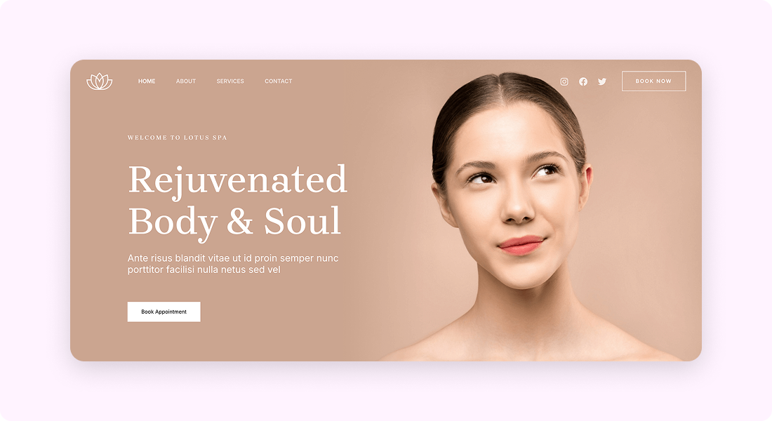
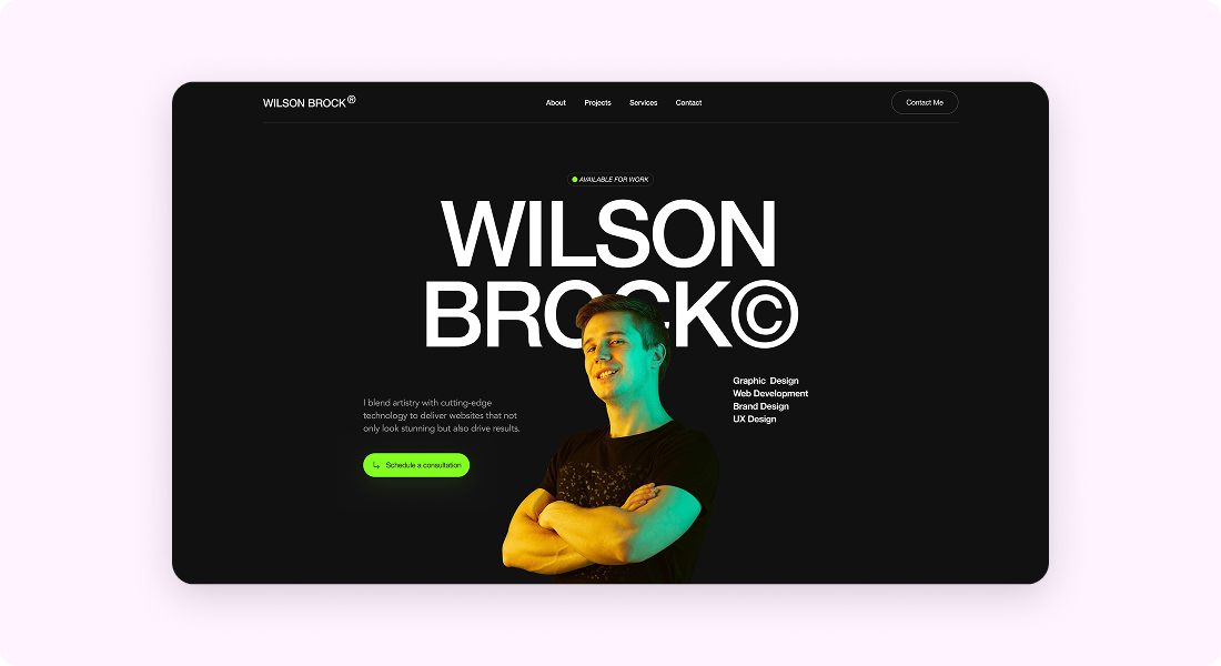
Built for Websites of Any Size
From single-page sites to business websites, use navigation menus to make browsing simple and intuitive.

Customize Everything, Effortlessly
Control every part of your navigation menu design inside Elementor.
Design That Fits Your Brand
- Adjust menu colors, typography, and spacing for a consistent look
- Style hover and active states for polished interactions


User-Friendly Experience For Better Clicks
- Responsive menus that adapt to any device
- Dropdown options to organize links better
Layouts Made Simple
- Horizontal or vertical menu placement for any header or sidebar
- Align menus neatly to fit your site structure

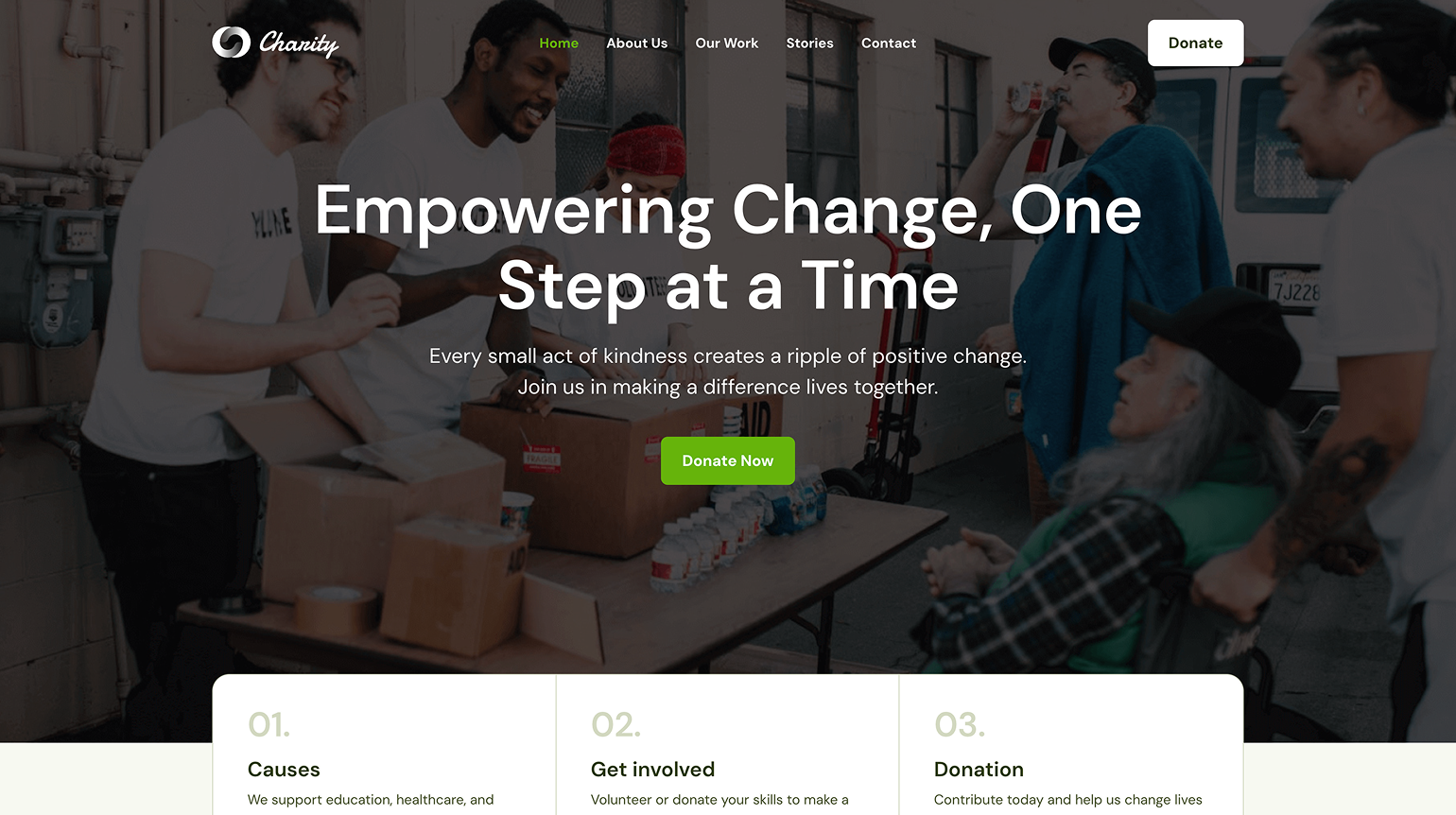
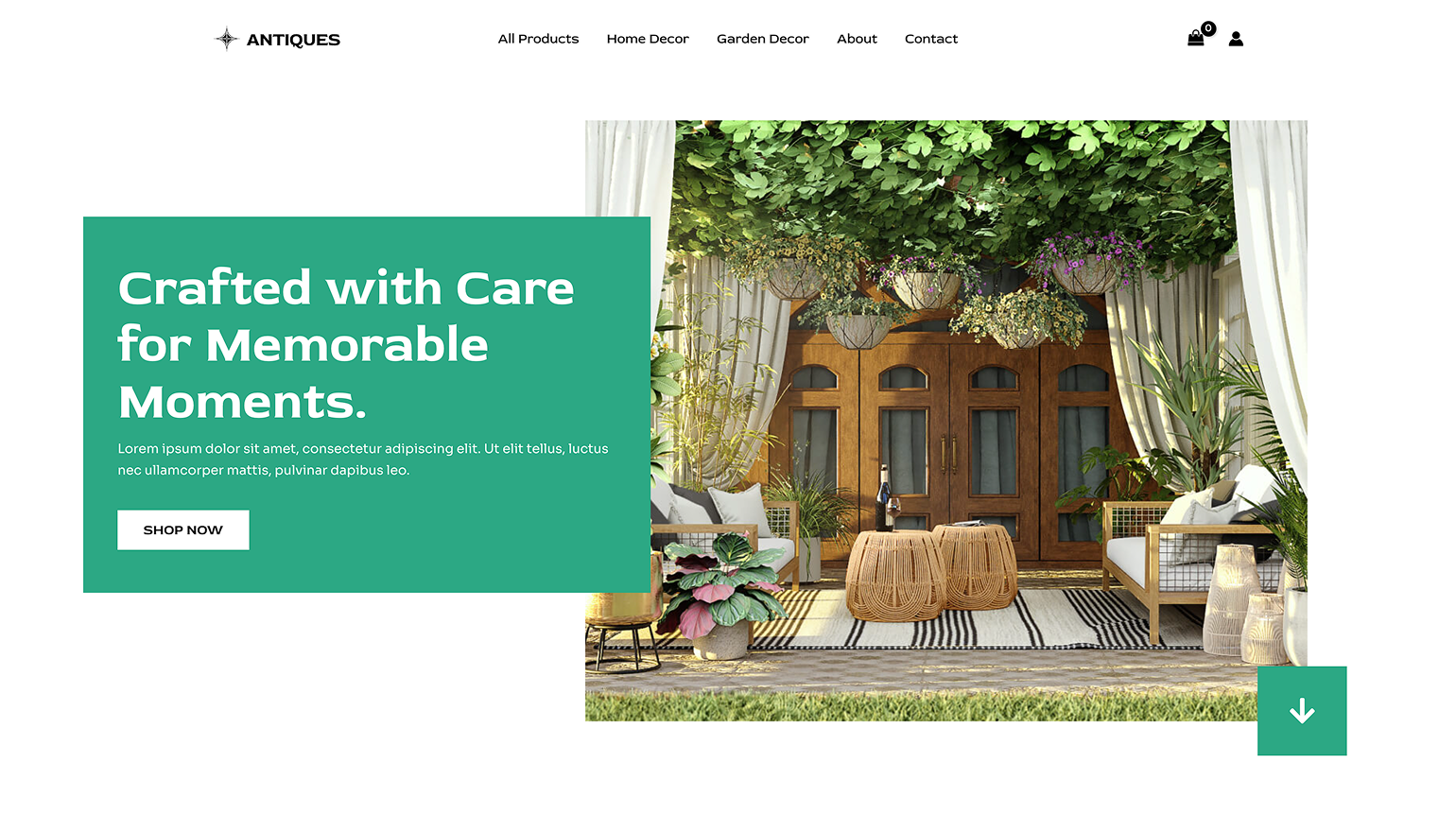
Works Across Any Website
Navigation menus fit perfectly into blogs, portfolios, eCommerce stores, and business websites—keeping navigation clear and accessible.


What Users Are Saying
Real people, real results: hear what our users have to say
Quick and simple navigation setup. My website feels complete now.
Daniel R.
Styling options let me match the menu with my brand colors perfectly.
Aria T.
Clean, responsive menus without extra plugins. Just what I needed.
